Marinette’s Colours Surface Pattern Designer
Marinette’s Colours Surface Pattern Designer

When I started painting again during the Covid pandemic of March 2020 I had no idea where my journey would take me. I am now making surface patterns with my artwork that can be put onto fabric and other products such as stationary. I have a Spoonflower shop where I have sold some of my designs and I also have some artwork on red bubble where it can be purchased on a variety of different products. I have the goal of licensing my work with companies and that’s something that I am working on currently with a ready to go Licensing Portfolio.
Okay, so I have been turning my watercolour artwork into repeat patterns, but the question is, how do we do that? So in this article I’m going to give you a brief overview of how I personally turn my work into patterns and the programmes that I use to do this. Of course there are other programs available and I am not an affiliate to any of these programs, or Instagram accounts that I am going to mention.
I really love making patterns and want you to be able to too. It’s so wonderful to make something different from your paintings and it gives an adaptability to your artwork that you wouldn’t otherwise have. It really opens up a world of options. You can also use the same piece of artwork to create multiple patterns.
Brief overview
Before I delve into the details, let’s just go over a brief overview of the process that I take when making patterns with my watercolour artwork. The first step of course is to paint. I’ll decide on a theme and then I will paint individual motifs rather than a full picture. These paintings are then scanned into the computer where I will transfer them to my iPad. Once on my iPad, I use a couple of different programs. One I use to remove the backgrounds from my paintings, and another to clean up my motifs and make my pattern layouts.
Sounds simple right? But there’s a little more to it so let’s delve into the details
The thing to remember is that when you’re painting to create patterns, it’s different to if you were painting a picture. You need to paint individual motifs that can then be arranged into different layouts to create the patterns that you want. It is possible to remove parts of a painting that you don’t wish to be in your pattern, which I will go into a little later, but if you know you’re going to use these motifs for a pattern, it’s easiest to paint just the motifs without surrounding items.
It’s also important to think about scale. When you scan your artwork into the computer you can make your motifs smaller but if you try to make them larger it can become pixelated decreasing the quality, so if you have a pattern in mind that you want for let’s say some curtains, you’re going to probably want bigger painted motifs than if you was making a pattern to go on the front of a notebook, so think about these things before you start painting.
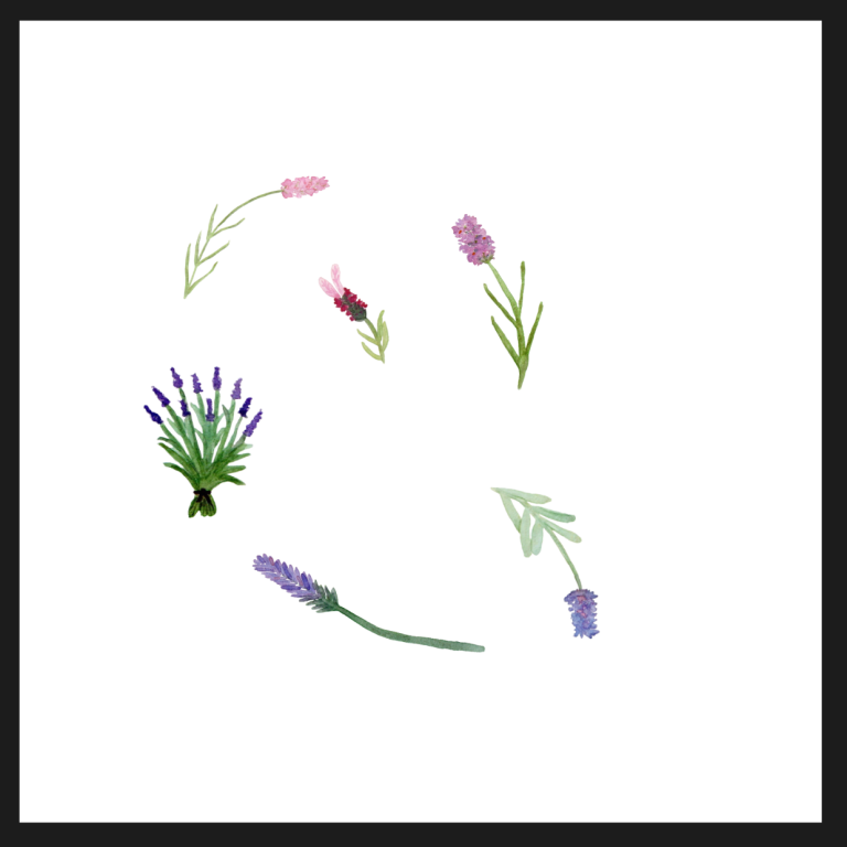
Another thing to remember when painting for patterns is it’s good to have a number of different motifs and different sizes of motifs. If you paint just one flower you can only do a very simple pattern. For example, your flower repeated in lines or diagonals etc. To really bring to life your designs and make them interesting it’s much better to have a number of different motif that you can use. As an example if you want to make a pattern with florals it’s a good idea to have several different paintings of the same flower from different angles, or different varieties of that flower. You could also have closed buds, semi opened flowers and fully opened flowers. All of these things will add variety and interest to your work.
Digitizing your Artwork
Now it’s time to scan your artwork into your computer.
Don’t worry at this point if you’re not 100% sure that you have enough motifs. You may decide once you start laying out your pattern that you need a few extras and that’s fine. You can go back, paint some more and scan them in but for now, let’s talk about scanning.
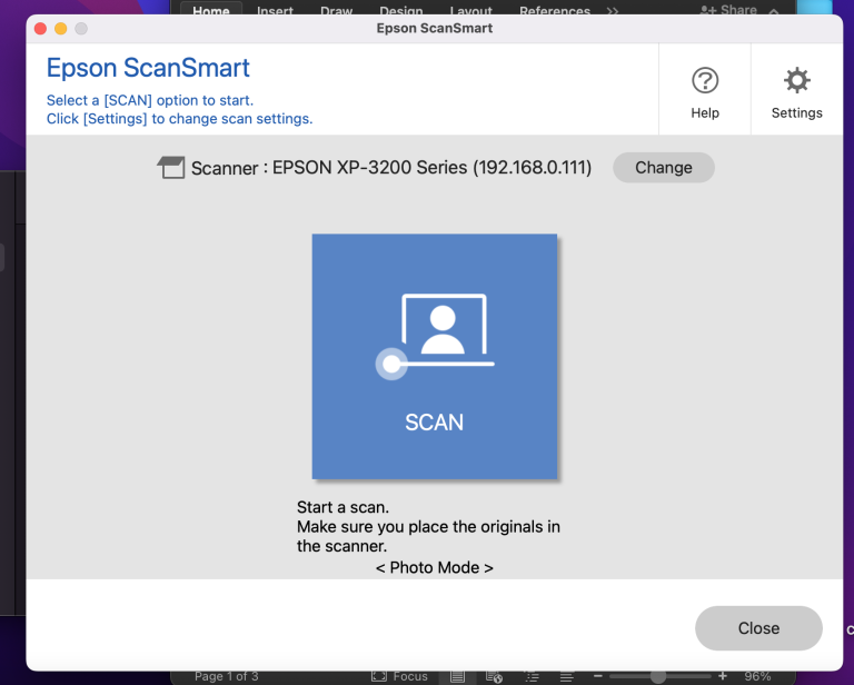
I can only give you from my own experience and I have at home a standard Epson printer (Scanner window pictured ->) that also has scanning capabilities. The scanner is A4 size so I have to bear that in mind with my artwork. I have seen artists online who create larger work and do multiple scans which they then have to try and Seamlessly join together but this is not something that I’ve tried personally.
If you do not have a scanner at home, there is the option to take a photograph of your artwork. Just bear in mind if you do this that it would need to be a very good photograph, very clear with good lighting so that the quality of your artwork is not lost in the photographic process.
Using my laptop I will scan my work in. You have options to scan in different DPI sizes which stands for dots per inch. In Layman's terms, the more dots per inch the clearer and more detailed your work will be, but also, if the DPI is very high it will make for very large files which could be more difficult to save. I like to scan my artwork at 300 DPI and of course in colour. There are multiple file types that you can save your work as too. I like to save mine as a JPEG as the files are not too large and they are easy to edit. Also, most companies that you can upload work to sell, such a Spoonflower, accept JPEG images. Because I like to work on my iPad, I will transfer the scanned images across onto my iPad where I can then clean up the images and use them as I wish.
Cleaning up your Motifs
Now that you have your beautiful artwork scanned in it’s time to remove the background and clean up your motifs. This is a really helpful process because as well as removing the background you can tidy up little areas where perhaps you’ve had a slight slip of the hand and painted where you didn’t want to. I get the shakes so this definitely happens to me at times! You can rectify these little errors in the cleanup process.
There are two different ways that I remove backgrounds so I will explain these one at a time.
1. Adobe Express. This free Adobe app has several different functions. Personally I love to use their background removal tool. This tool is good to remove backgrounds when your artwork has well-defined edges. If your work has much softer fluid edges, you may prefer to use the second method. It really couldn’t be easier in Adobe Express. You simply select the remove background option. It will then ask you to select your file which can be either from your photos or your files, you can even take a photo if you wanted to. Once you’ve selected your file Adobe Express does the work for you and you will have your artwork with background removed. Whilst this is a brilliant way to remove a background, it does often leave slightly untidy edges. You will want to clean these up in the same way as the removal process that I will now explain.
2. Affinity designer 2. I love this app because it’s good for so many different things. In this instance we want to use it to either remove a background or simply tidy our motifs. To do this, we would need to be in the pixel persona on affinity designer. This is not an affinity designer tutorial so I will not be explaining in intricate detail each part of the process. I do know that there are lots of brilliant videos on YouTube as well as designers who have created lessons for beginners on Affinity Designer.
In the pixel persona of Affinity designer you can place your photo or your file of your motif. This process is the same whether you are simply tidying your motif or if you’re removing the full background. The only difference would be the size of the eraser that you use. In the pixel persona there is an erase function. (picture of a little eraser pictured left <-) When you select that you can then select the size of the eraser. So, imagine that you have a pencil that is an eraser. The thickness of the tip of that pencil would be how much is erased in one motion. This is measured in pixels for the erase brush. If I am simply tidying a motif, I tend to use a five pixel size and if it’s very fine work even one or two pixel. If I have a whole background to remove then I will of course use a much larger 60 or maybe even 80 pixel size so that I can quickly clear larger areas. Once the larger area is cleared, I will then go down to the much smaller size to tidy up more detailed areas.
While I’m sure some people will find this quite a monotonous task, I actually find it really therapeutic and almost addictive. Once I start, I just don’t want to stop! It can feel almost meditative. If I have a painting that has already had the background removed in Adobe Express I will use a small pixel erase brush. I will zoom in as much as possible so that I’m looking at almost individual pixels and I will just work my way around the edge of the motif erasing any bits that I don’t want. If there’s little white bits around the edge, I can take those off and if there’s been a slip of the brush I can tidy that up too, so I just work my way round until I’ve done the whole motif. I can then zoom back out to see if there’s any bits that still need refining. Some paintings might have blank areas within the artwork that you want to erase out as well. This takes some time but tidying up the motifs makes a huge difference when you go to making your patterns, especially if you are going to have a coloured background to your pattern.
We don’t want our artwork to end up looking too manufactured though. So what I would suggest when tidying up your motifs is even if your painting has a completely straight edge maybe don’t erase a 100% straight line because there’s not very many of us out there who can literally paint a straight line. We want our work to still look hand painted after it’s been cleaned up, so it’s important not to be too precise with our erasing if we want to keep that hand painted look.
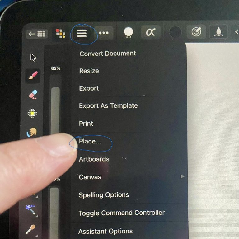
Option to place your file or photo into Affinity Designer
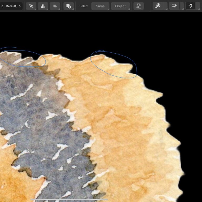
This bee has had the background removed in Adobe express but as you can see arounf the edges there is still some of the white of the paper.
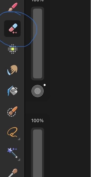
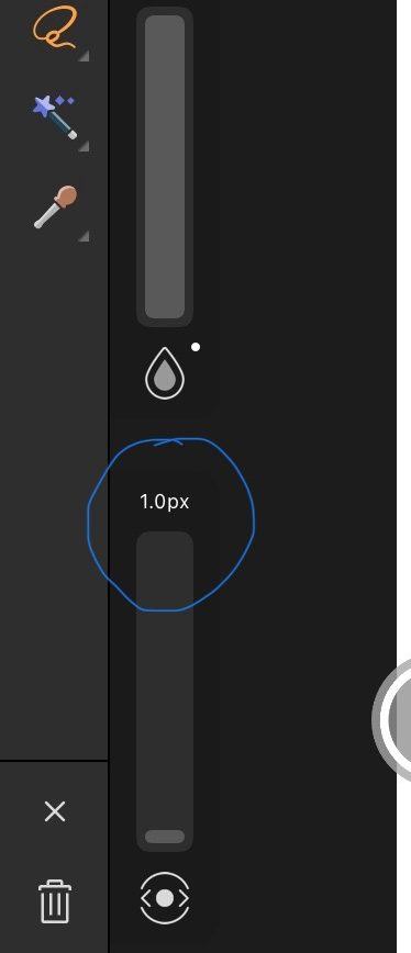
In the pixel Persona on Affinity designer Ipad select the eraser (pictured above left) Then select the size (above right)
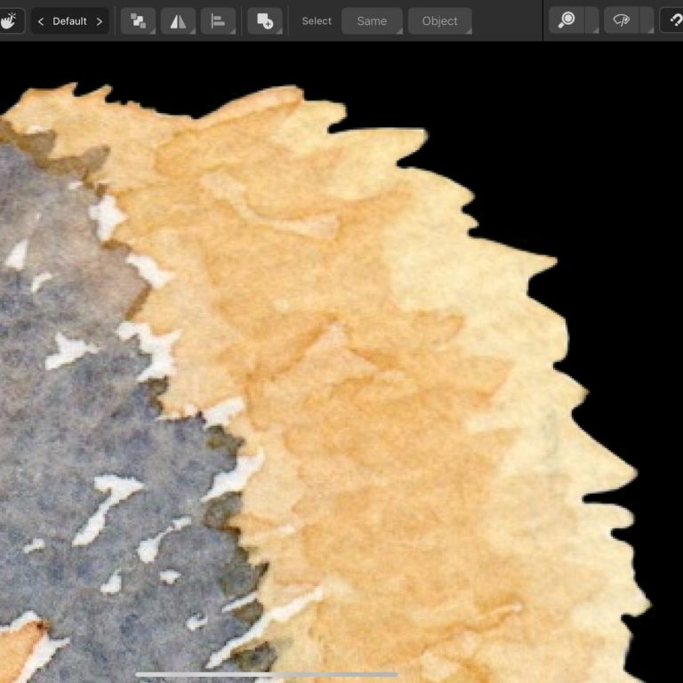
The watercolour bee after having its cleanup.
Arranging your pattern
Now comes the really fun, if not slightly challenging, part. I love to use Affinity designer to lay out my surface patterns because it makes spacing and seamless repeats easy to put together. The first thing you need to do is create your art board. Again, this is not an affinity tutorial so I’m not going to go into deep explanation of each process but you want to create an art board that is the size that you want your pattern repeat to be. For example, if your work is scanned in at 300 DPI an art board of 300 x 300 pixels would be 1 in square. So if you want to make a pattern that repeats every 8 inches then you want a board that is 1200 pixels by 1200 pixels.
You want to be in the designer persona for this task. There are many different layouts that can be used when making patterns but for this blog post, I’m going to use the example of a simple scattered layout. Remember when bringing your motifs into affinity designer that you can make them smaller but be careful about making them larger. You may get away with making them a little larger but you don’t want them to become pixelated as it will spoil the end result.
If you want to make a seamless repeat then it’s good to have motifs that go off the edge of the canvas. When doing this though you will need to perfectly align the other part of the motif to the other edge of the canvas so that they make a seamless connection when the pattern is duplicated. For example, if your canvas is 2000 pixels wide you could place a motif at -200 pixels then duplicate it and place it at 1800 pixels.
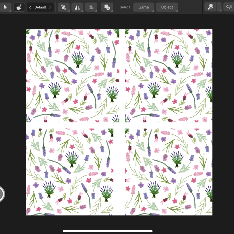
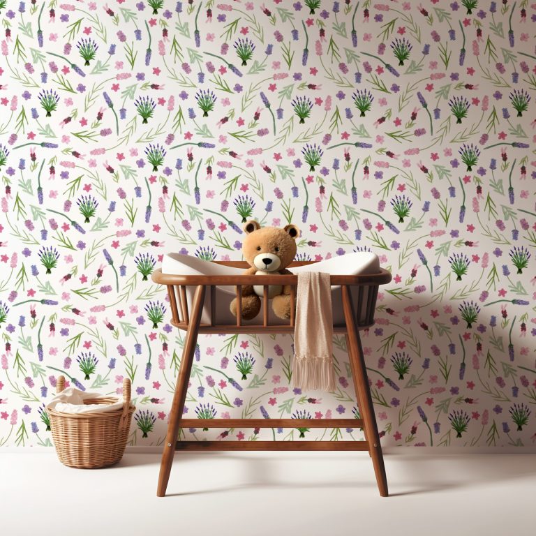
Have fun moving your motifs around in different layouts until it feels cohesive and evenly spaced. (below left) I can’t tell you exactly what to do here as you need to do what feels right to you depending on the number and size of your motifs. To test that the repeat works seamlessly you can export the design as a jpeg then in another designer art board bring that JPEG in and duplicate it to check everything lines up ok. (below centre) And there you have it. Your watercolour artwork has become a repeating pattern! Now imagine the possibilities!!! (below right mockup by @victorystudio11 on instagram)
I’d love to know if this article was helpful and to see your designs. Tag me on Instagram @marinettescolours or pop me an email at leah@marinettescolours.co.uk
If you’ve made it this far thank you so much for sticking with me. I hope you’ll stop by again soon and why not sign up for Marinette’s Colours emails to get the latest news.
This is my Scanner programme screen as an example. Other makes and models will differ.
Email: leah@marinettescolours.co.uk
© Copyright. All rights reserved.
We need your consent to load the translations
We use a third-party service to translate the website content that may collect data about your activity. Please review the details in the privacy policy and accept the service to view the translations.